I still remember standing in the middle of my first “grown-up” apartment, staring at a wall of tiny, confusing paint swatches that felt more like a high-stakes math exam than a design choice. I had spent three hours scrolling through Pinterest, convinced that if I didn’t find the perfect shade of “eggshell” or “sandstone,” my entire life would somehow feel uncoordinated. It’s exhausting, right? We’ve been sold this idea that figuring out how to choose a color scheme requires an expensive interior designer or a degree in fine arts, but honestly, that’s just a lot of unnecessary noise.
I’m not here to feed you those lofty, impractical design theories that only work in a museum. Instead, I want to give you the real-world blueprint for picking colors that actually vibe with your furniture, your lighting, and—most importantly—your mood. Think of this as the “secret sauce” recipe for your home; I’m going to break down the process into simple, actionable steps that take the guesswork out of the equation. Let’s stop overthinking the swatches and start building a space that actually feels like home.
Table of Contents
Mastering Interior Design Color Theory for Real Life
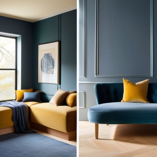
Now, I know what you’re thinking: “Color theory sounds like something I’d need a PhD to understand.” But honestly? It’s a lot like making a great chili. You’ve got your base ingredients—the neutrals—and then you’ve got those spices that really make the flavors pop. When we talk about interior design color theory, we’re really just talking about how different hues play together to create a vibe. You can lean into warm vs cool color palettes to dictate the energy of a room; think cozy, sun-drenched yellows for a breakfast nook versus calming, misty blues for a bedroom where you actually want to catch some Z’s.
It’s also about understanding room mood and color psychology so you don’t accidentally turn your home office into a high-intensity nightclub. If you want a space that feels balanced, look into complementary color combinations—those colors that sit opposite each other on the wheel. They provide a natural tension that feels intentional rather than chaotic. Just remember, you don’t need to paint every wall a bold shade; sometimes, the most sophisticated look comes from a solid foundation with just a few strategic pops of color.
Navigating the Balance of Warm vs Cool Color Palettes
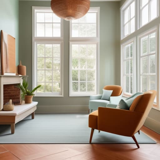
Think of picking between warm and cool tones like deciding whether you want a cozy bowl of tomato soup or a refreshing glass of iced lemonade. It’s all about the vibe you’re trying to cook up in your space. When we talk about warm vs cool color palettes, we’re really talking about the energy of the room. Warm tones—think terracottas, soft yellows, or even a rich ochre—act like a heavy blanket; they make a room feel snug, intimate, and incredibly inviting. These are perfect for living rooms or dining areas where you actually want to linger and chat.
On the flip side, cool tones like sage greens, dusty blues, or soft lavenders are more like a breath of fresh air. They tend to recede visually, which can actually make a cramped room feel a bit more expansive and calm. Understanding room mood and color psychology is the secret sauce here; if you’re trying to turn your home office into a zen zone for deep focus, you’ll probably want to lean into those cooler, tranquil hues. Just remember, you don’t have to pick a side completely—a little bit of balance goes a long way.
5 Practical Ways to Nail Your Palette Without Losing Your Mind
- Start with your “Hero Piece.” Think of this like the main protein in a recipe; everything else revolves around it. Instead of picking colors first, look at that rug you love or that vintage velvet sofa. Let that piece dictate the supporting cast of colors so nothing feels out of place.
- Use the 60-30-10 Rule to keep things balanced. This is my secret sauce for avoiding a room that feels either too chaotic or too boring. Aim for 60% of a dominant color (usually your walls), 30% of a secondary color (upholstery or curtains), and a 10% “pop” of an accent color (pillows or decor). It’s the perfect ratio for visual harmony.
- Don’t forget about the “Lighting Variable.” A color that looks like a dreamy sage green in the store might end up looking like a swampy mess under your warm living room bulbs. Always grab a few samples and test them on different walls at different times of the day before you commit to the big bucket of paint.
- Build in some “Visual Breathing Room.” Just like a good stew needs a bit of seasoning rather than just salt, a room needs neutral space to let the colors shine. If you’re going bold with your palette, balance it out with whites, creams, or light grays so your eyes have a place to rest.
- Think about the “Vibe Check” of each room. Function matters! Your home office might need energizing yellows or blues to keep you focused, while your bedroom should lean toward those calming, low-energy tones. Match the color’s psychological “flavor” to what you actually do in that space.
Quick Wins for Your Color Journey
Think of your color palette like a well-balanced recipe; you need a solid base of neutrals, a splash of secondary colors, and just a pinch of bold accents to keep things from feeling bland.
Don’t feel pressured to get it perfect on day one—start with a single “anchor” piece, like a rug or a piece of art, and build your room’s vibe around that to avoid decision fatigue.
Always test your colors in your own space before committing; a shade that looks like a dreamy sunset in a store can easily turn into a moody basement once it hits your actual living room walls.
The Secret Ingredient to a Great Palette
“Picking a color scheme isn’t about following a textbook; it’s like perfecting a family recipe. You might start with the basic ingredients, but the magic happens when you adjust the seasoning to fit the specific mood and energy of the room you’re actually living in.”
Morgan Bennett
Bringing Your Vision Home
At the end of the day, picking a color scheme isn’t about following a strict set of design rules or trying to make your living room look like a museum exhibit. It’s about taking those big concepts—like understanding color theory or deciding between a cozy warm palette and a crisp cool one—and applying them to your actual, messy, beautiful life. Think of it like perfecting a family recipe; you might start with the basic ingredients, but it’s your personal touch that makes the final result truly delicious. Whether you’re leaning into bold accents or sticking to a calming monochromatic vibe, the goal is to ensure your space works for you, not the other way around.
I know that staring at a wall of paint swatches can feel a bit overwhelming, but don’t let the fear of making a “wrong” choice keep you stuck in a neutral limbo. If you mess up, it’s not a permanent catastrophe—it’s just a learning experience, and you can always pivot. My best advice? Trust your gut and embrace the process. Your home should be a reflection of your journey and a sanctuary that recharges your batteries. So, grab those samples, start experimenting, and let’s turn those empty rooms into spaces that truly feel like home. You’ve got this!
Frequently Asked Questions
How do I pick a color scheme that works if I have a bunch of mismatched furniture I'm not ready to get rid of yet?
Think of your mismatched furniture like a kitchen full of random leftovers—it looks chaotic until you find the right sauce to tie it all together. To make it work, stop trying to match everything and start looking for a “bridge.” Pick a cohesive color palette for your walls and textiles (like pillows or rugs) that features colors found in your various pieces. This creates a visual thread that makes the “clutter” feel like a deliberate, eclectic choice.
Is there a way to test these colors in my actual room without committing to a full gallon of paint and a massive headache?
Oh, I’ve been there—standing in the paint aisle, staring at fifty shades of “off-white,” feeling like I’m about to make a life-altering mistake. Don’t panic! Think of it like tasting a sauce before you pour it into the main dish. Grab some peel-and-stick paint samples or even just those little swatch cards. Tape them to different walls and watch how the light changes them from morning to night. It’s a total game-changer.
How much should I actually be budgeting for paint and accents versus just sticking to the colors I already have?
Think of your budget like a new recipe: you don’t need to buy every exotic spice in the pantry to make a killer meal. If your current furniture is solid, don’t feel pressured to replace it. I usually suggest the 70/30 rule: spend 70% on the “big” stuff like paint and maybe a new rug, and keep 30% for those little accent pieces. It’s much cheaper to swap a pillow than a sofa!